Augusta Home Renovation | Evans Georgia Remodel | Augusta Georgia Photographer | Chloe Giancola's Kitchen Reno
Where to begin! This has been months in the making, we knew when we first toured this house in January with Nichole it needed some work. Scratched up floors, worn out cabinets, dirty tile and carpet, and every color and design choice was just not our style. But our biggest priorities were a bigger fenced in backyard for the kids (yep!) and that we didn’t want to take down walls. If the layout was good and we didn’t have to reconfigure things, I could envision us replacing and updating things. The floorplan was more perfect than I even realized as I sit here typing this with a direct view to the kid’s playroom right across from me. We also really liked that the neighborhood was established, and has a lake, playgrounds, courts, and fields for the neighbors.
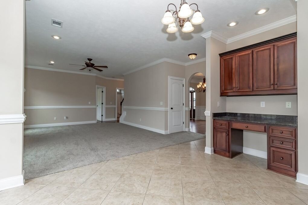
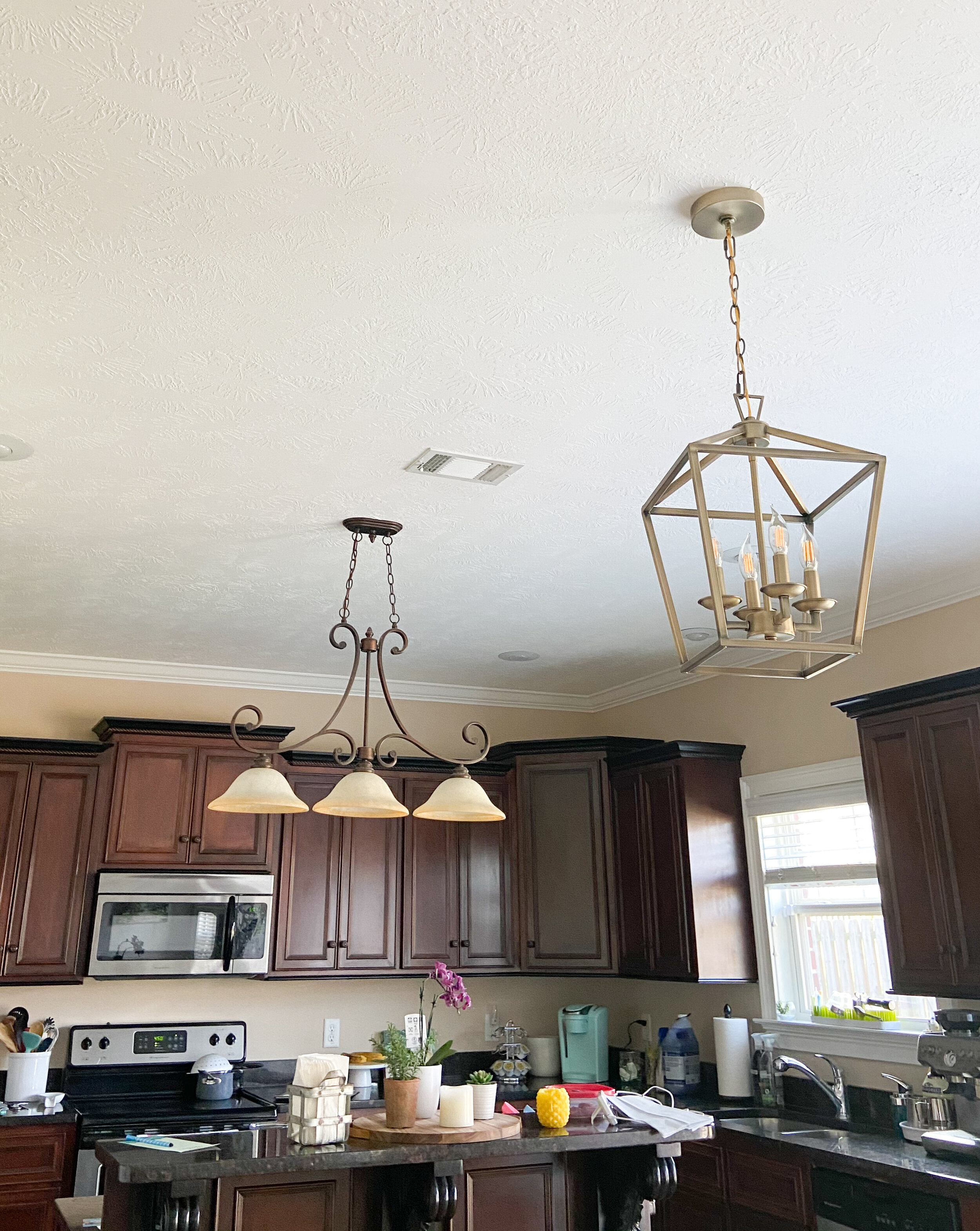
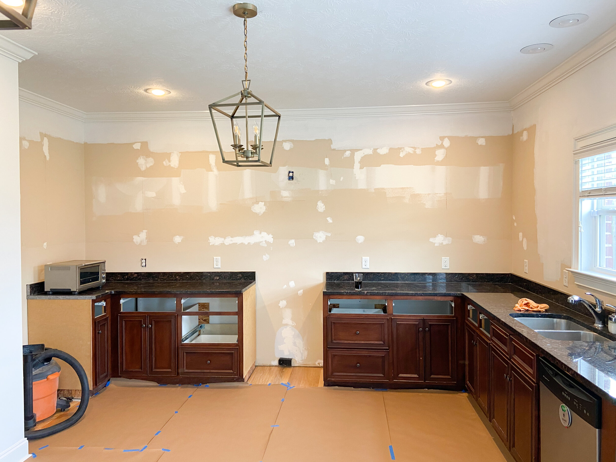
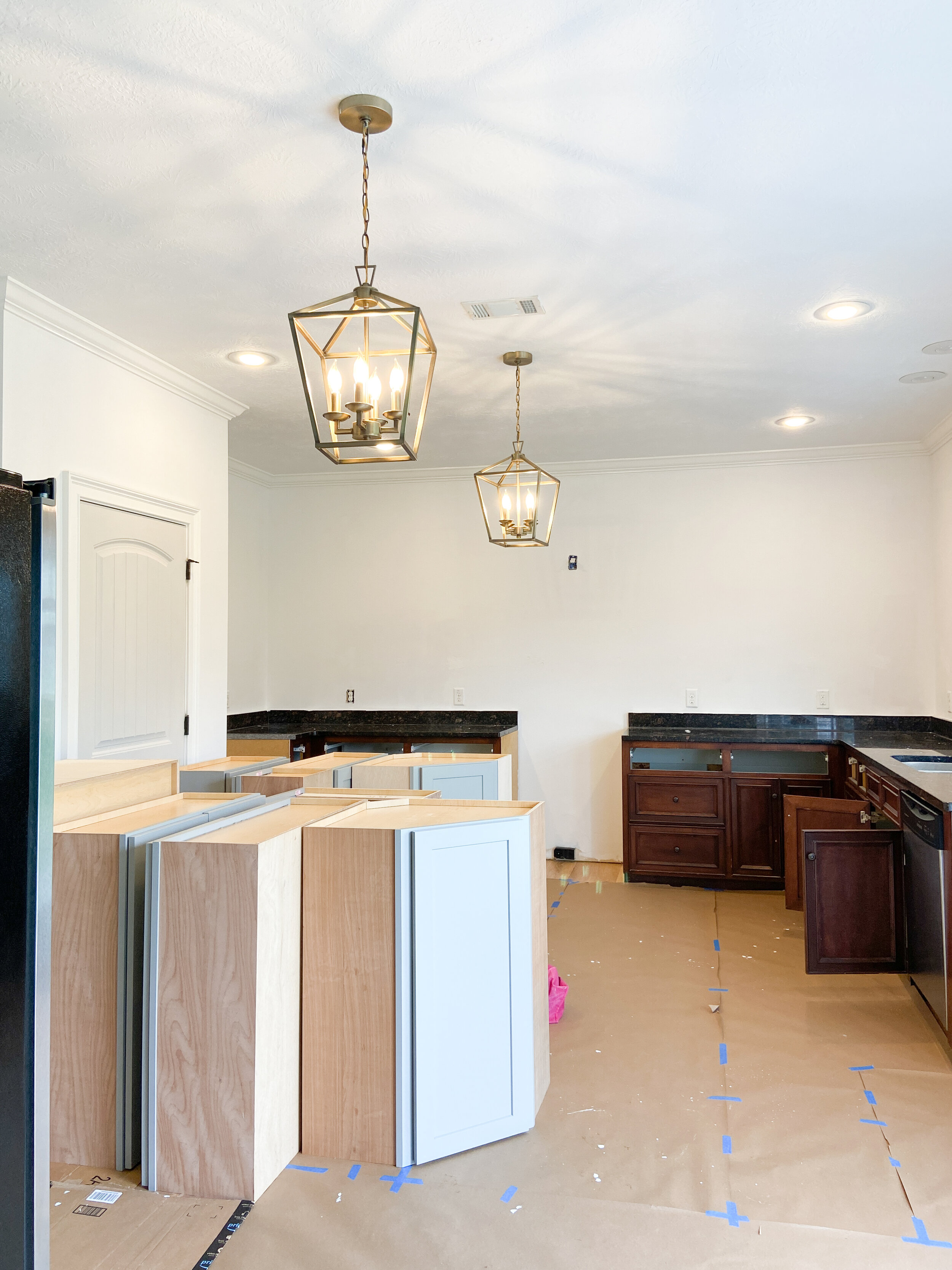
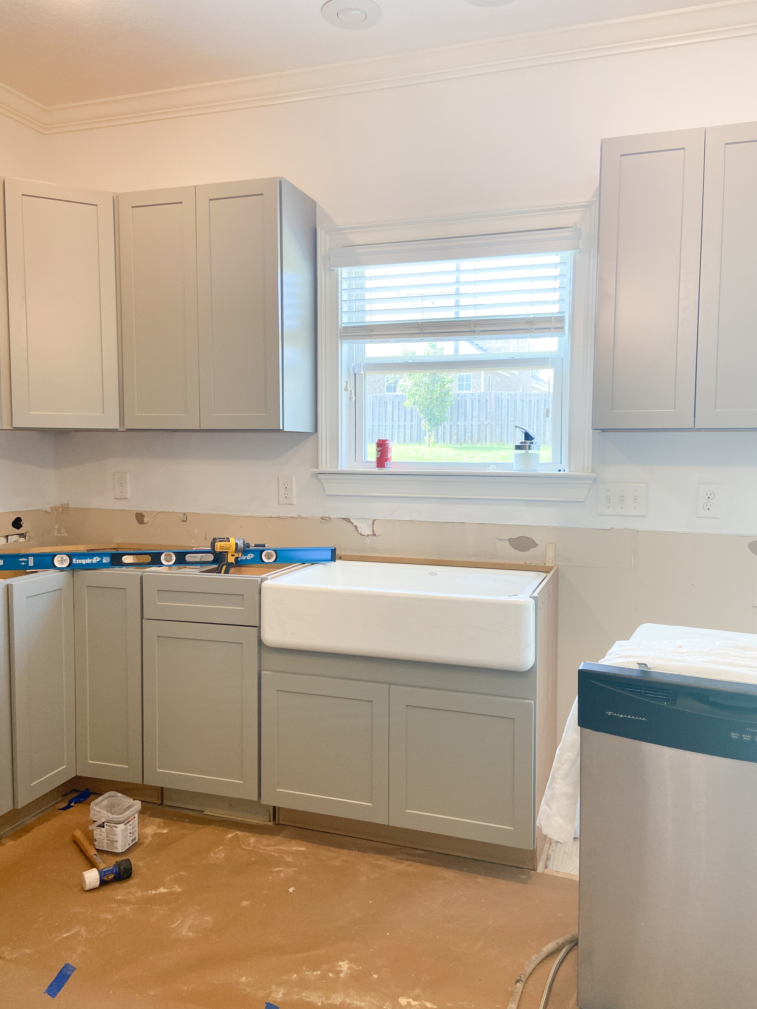
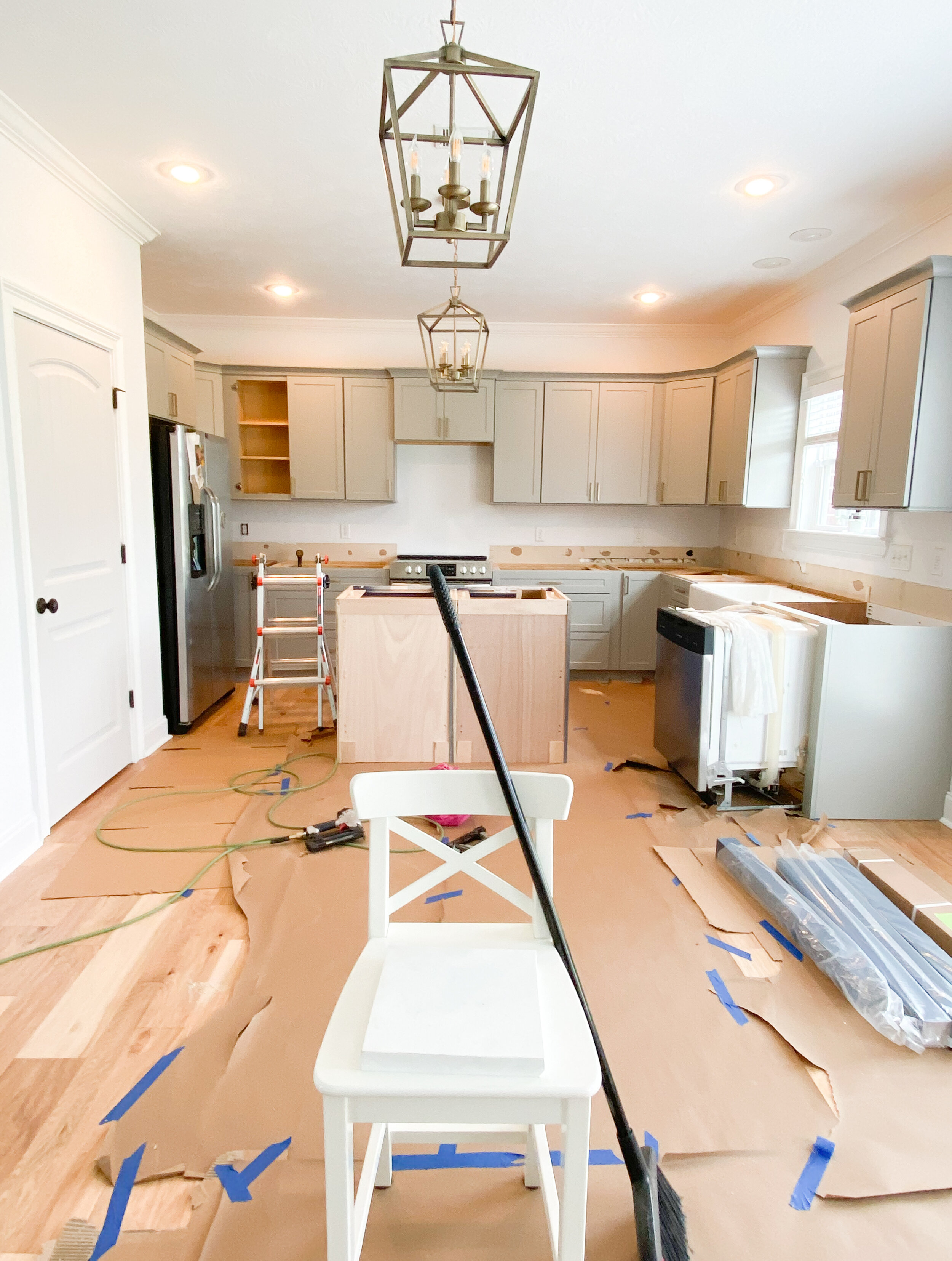
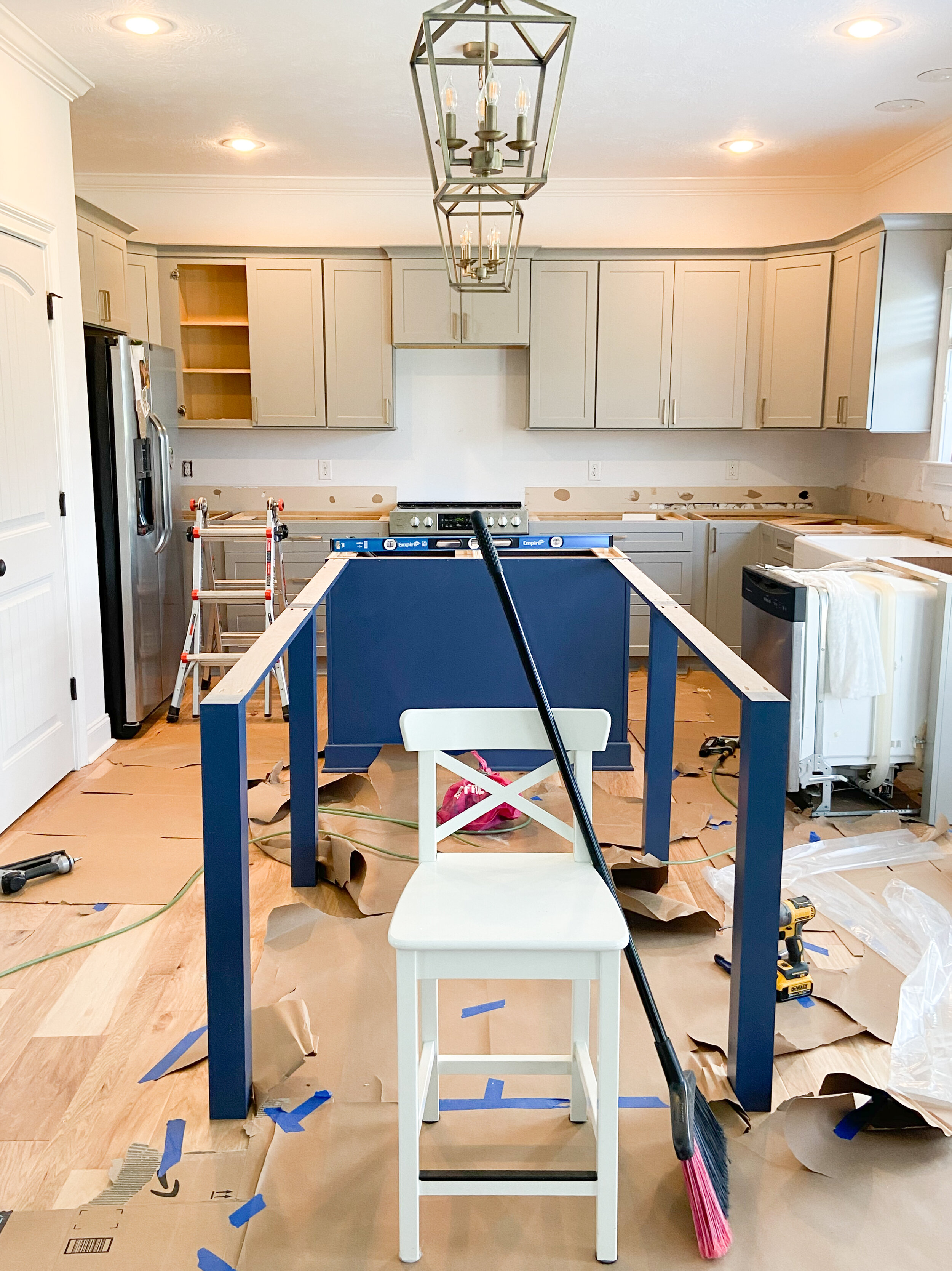
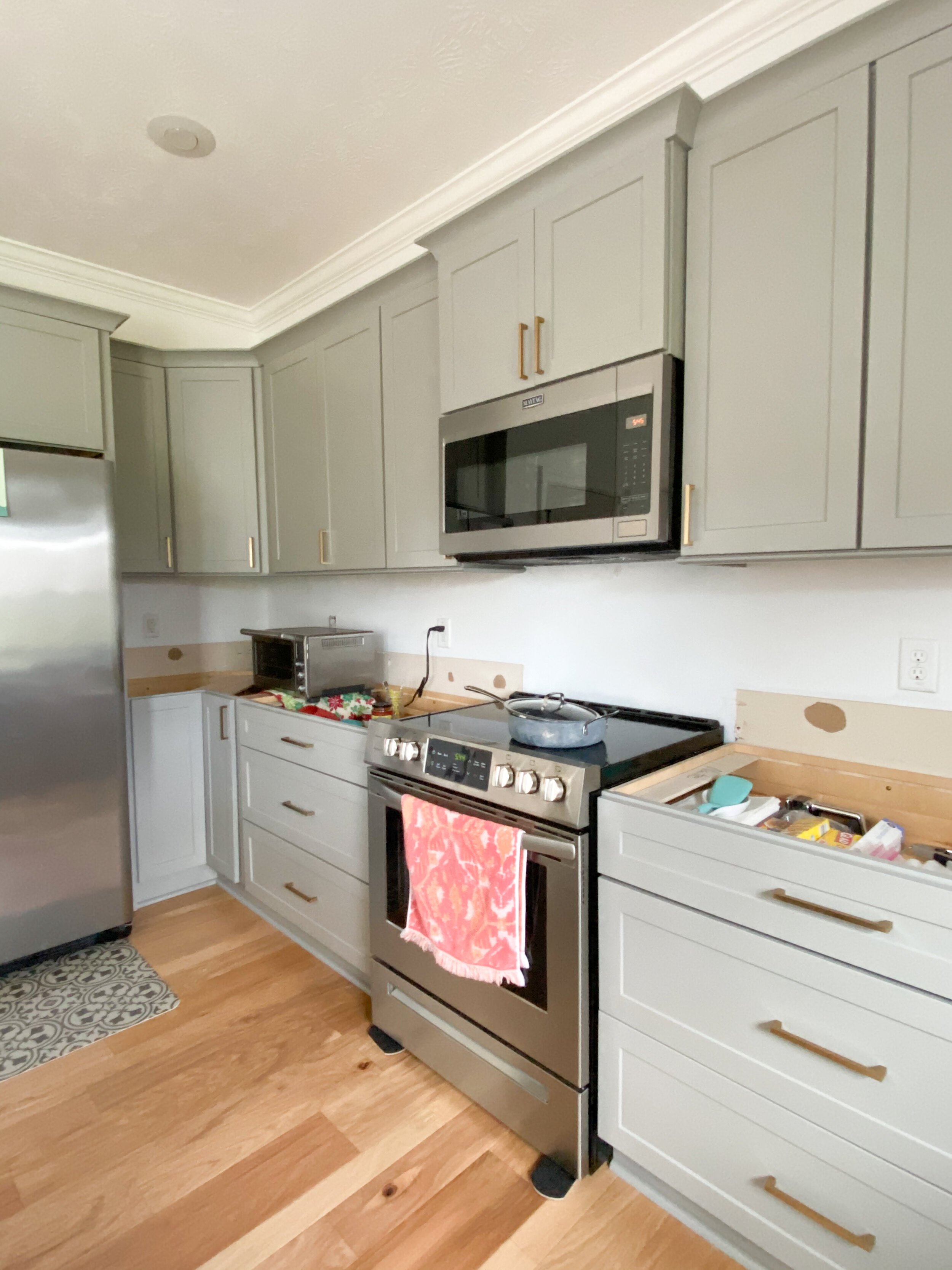
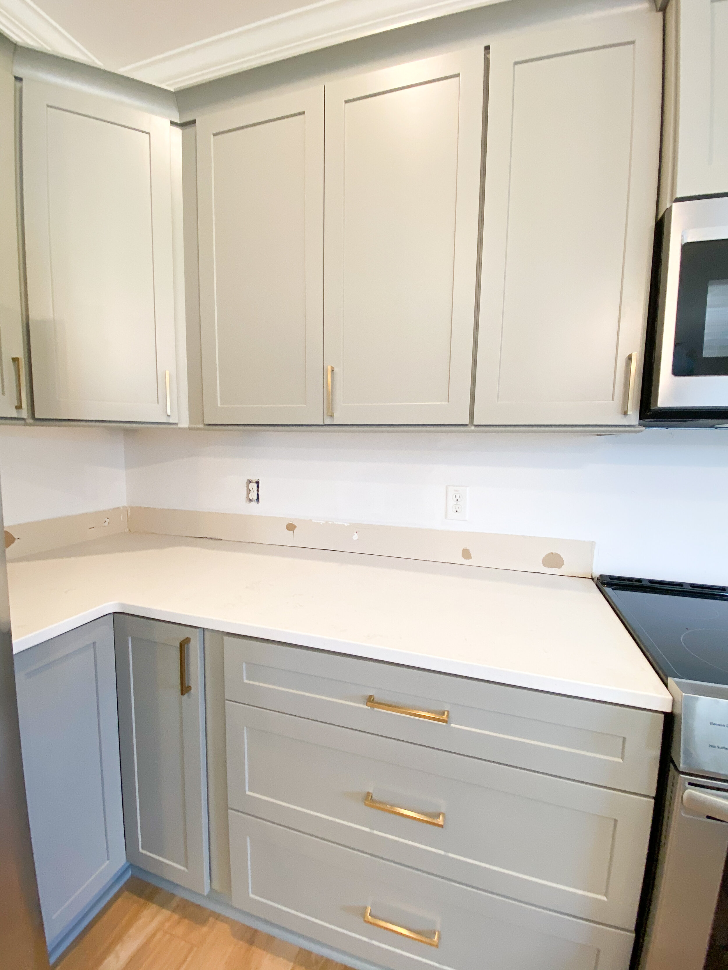
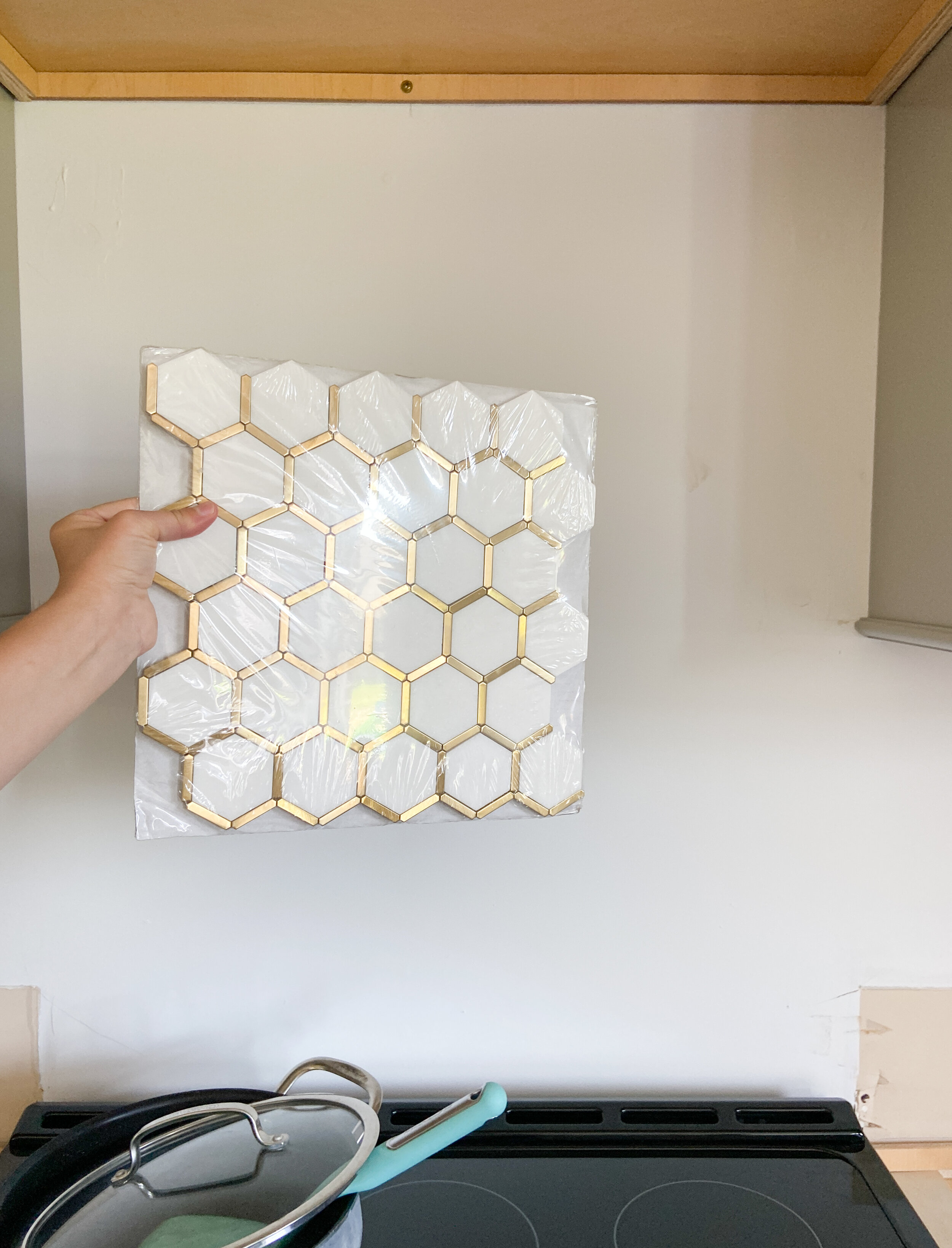
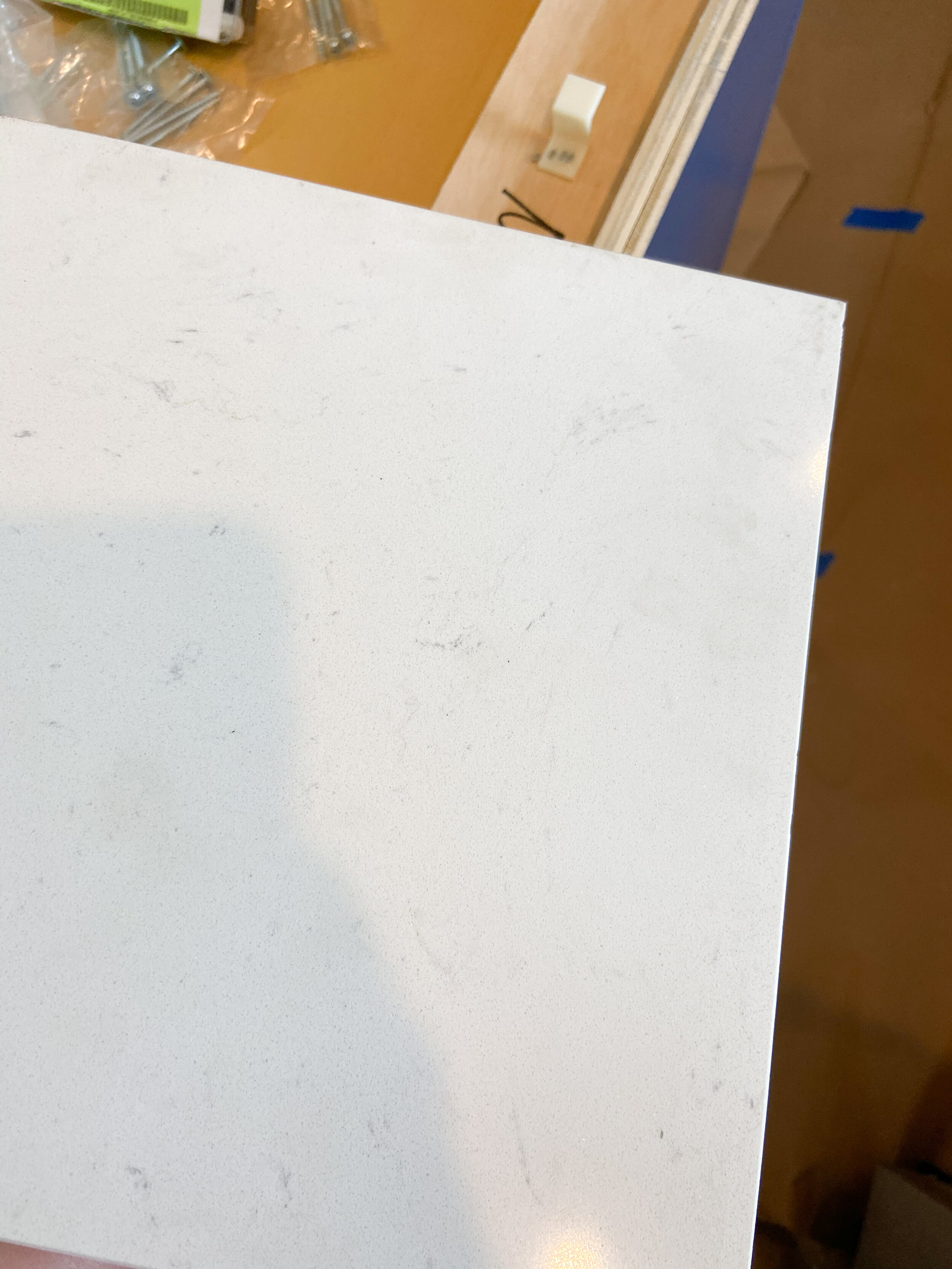
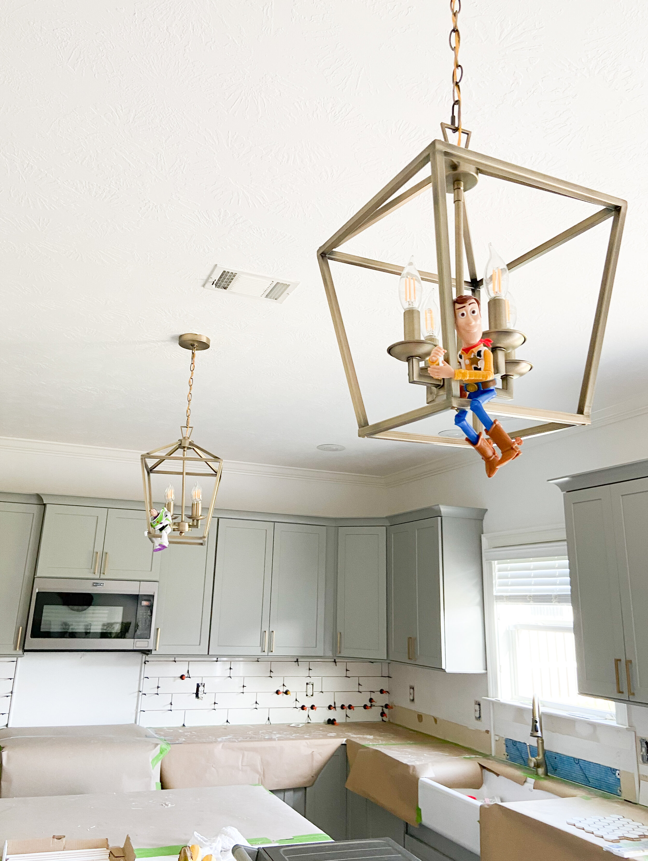
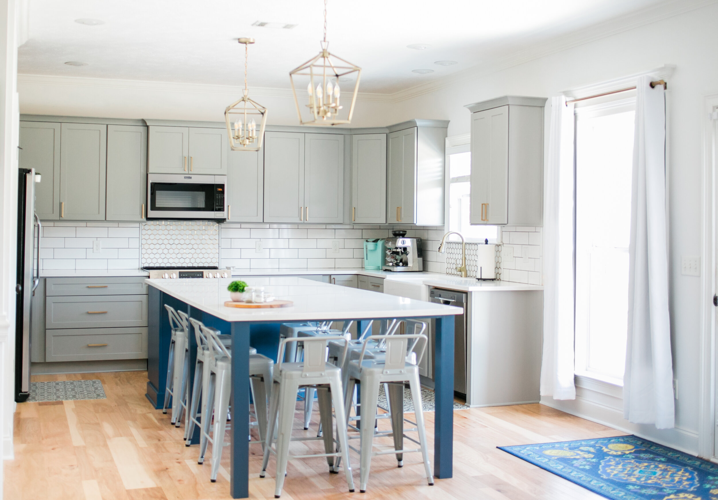
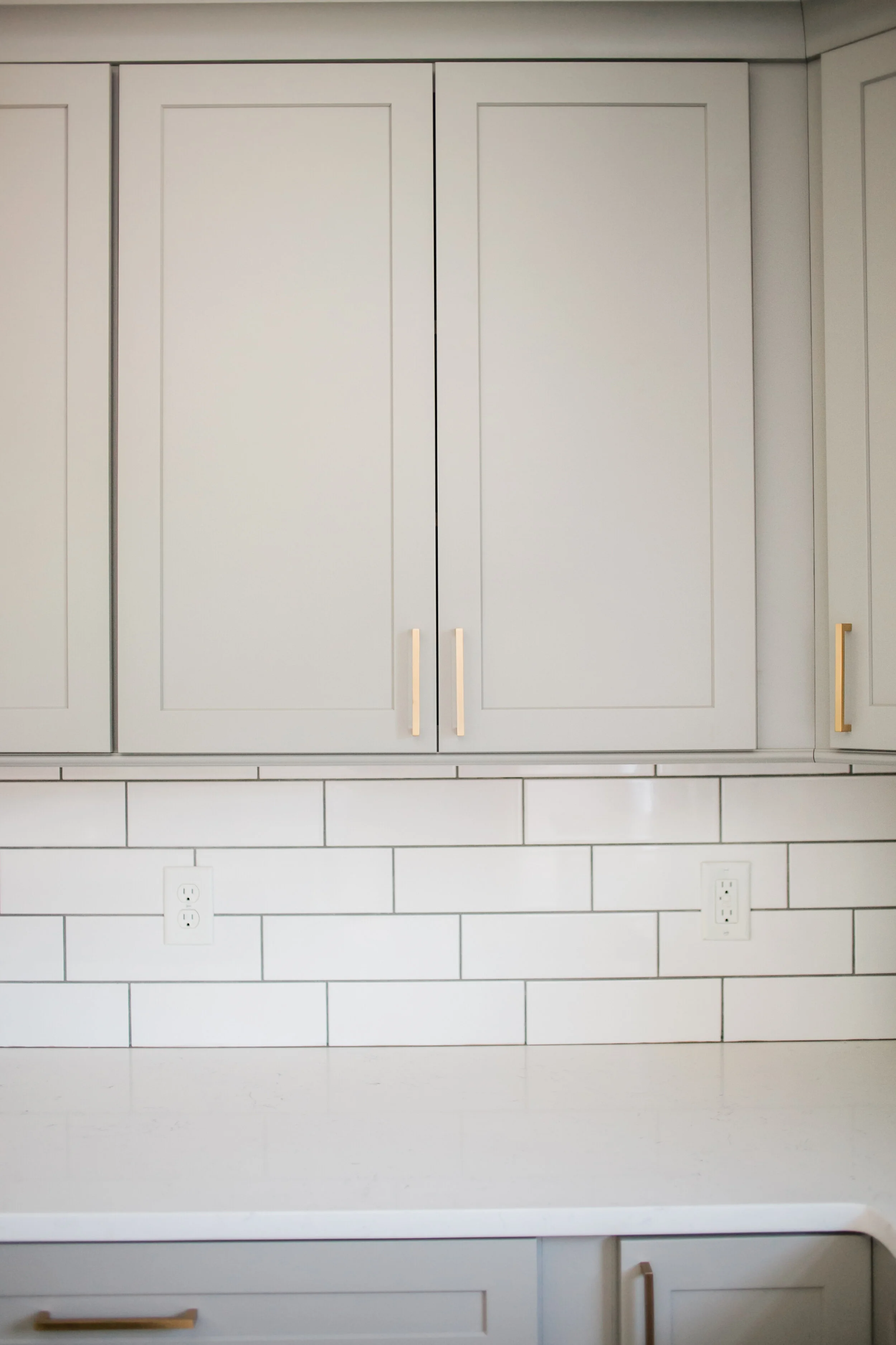
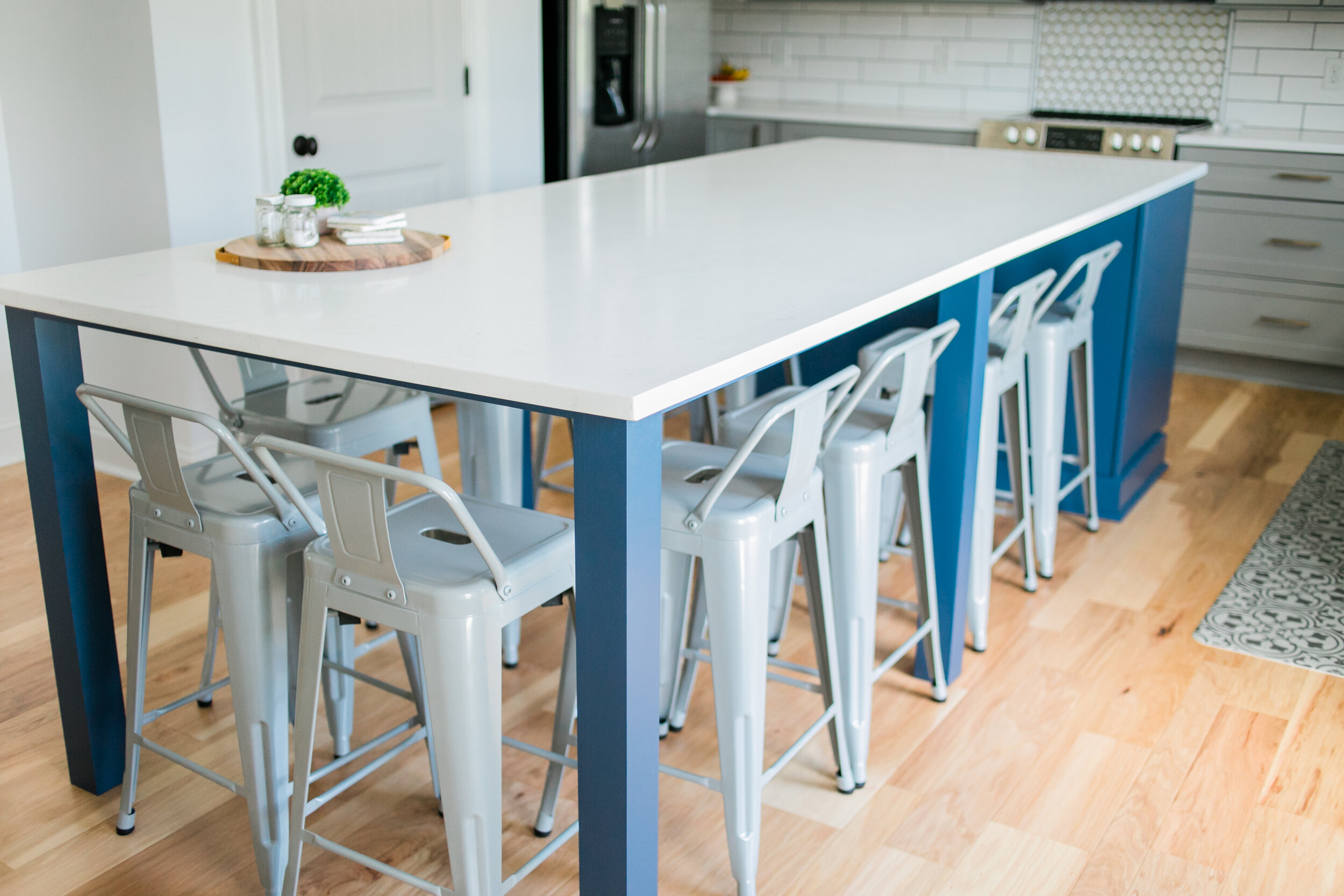
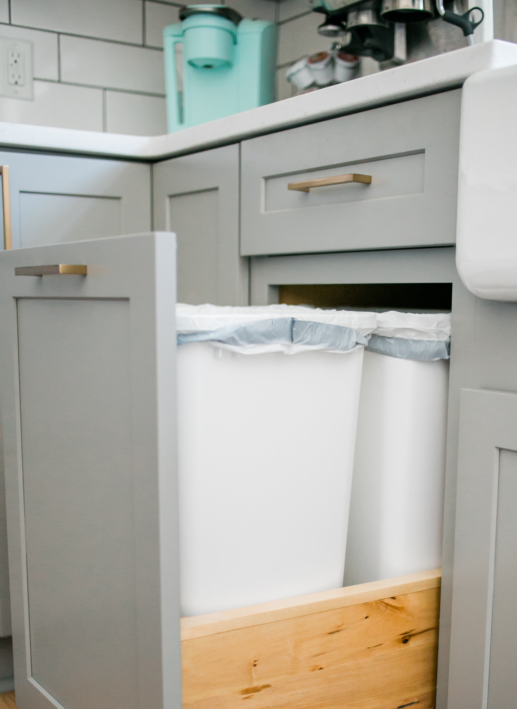
You may know I love blue ;) And once I thought about a blue island, I knew nothing else would compare to having a bold/dark blue/statement piece island. Nathaniel and I also used our island at the old house (that we extended with the help of my FIL) as our kitchen table. So that was the plan for this house as well. Island = where we eat, work, talk, everything, no other dining table, so it was important. And we knew we were going to go bigger! We had white cabinets in our Aiken home, so we decided to go with gray and bright white countertops with a touch of sparkle if you look close enough. Nathaniel gets credit for so much done in this house, and for this particular blogpost changing those pendant lights you see, painting the beige walls white, touching up baseboards, and us taking apart a lot of the kitchen ourselves. The desk you see in the “before” photo is empty as we are waiting on a hall tree from a local woodworker (that will be another blogpost) to serve as a drop zone for keys, backpacks, hats, etc. I plan to put each of our initials up above a hook! For the backsplash we decided the honeycomb would be too busy for the entire kitchen, but enough for the stove accent. While we were talking I had the idea to add it behind the faucet too! I love it so much! We did an elongated subway tile and instead of the standard size and brick pattern, had it laid in the 1/3 pattern.
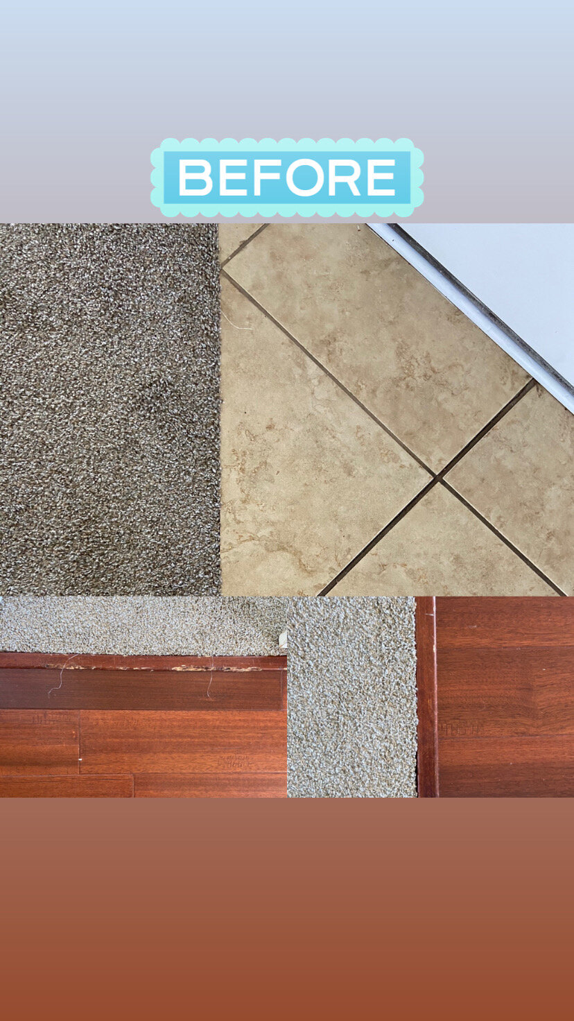
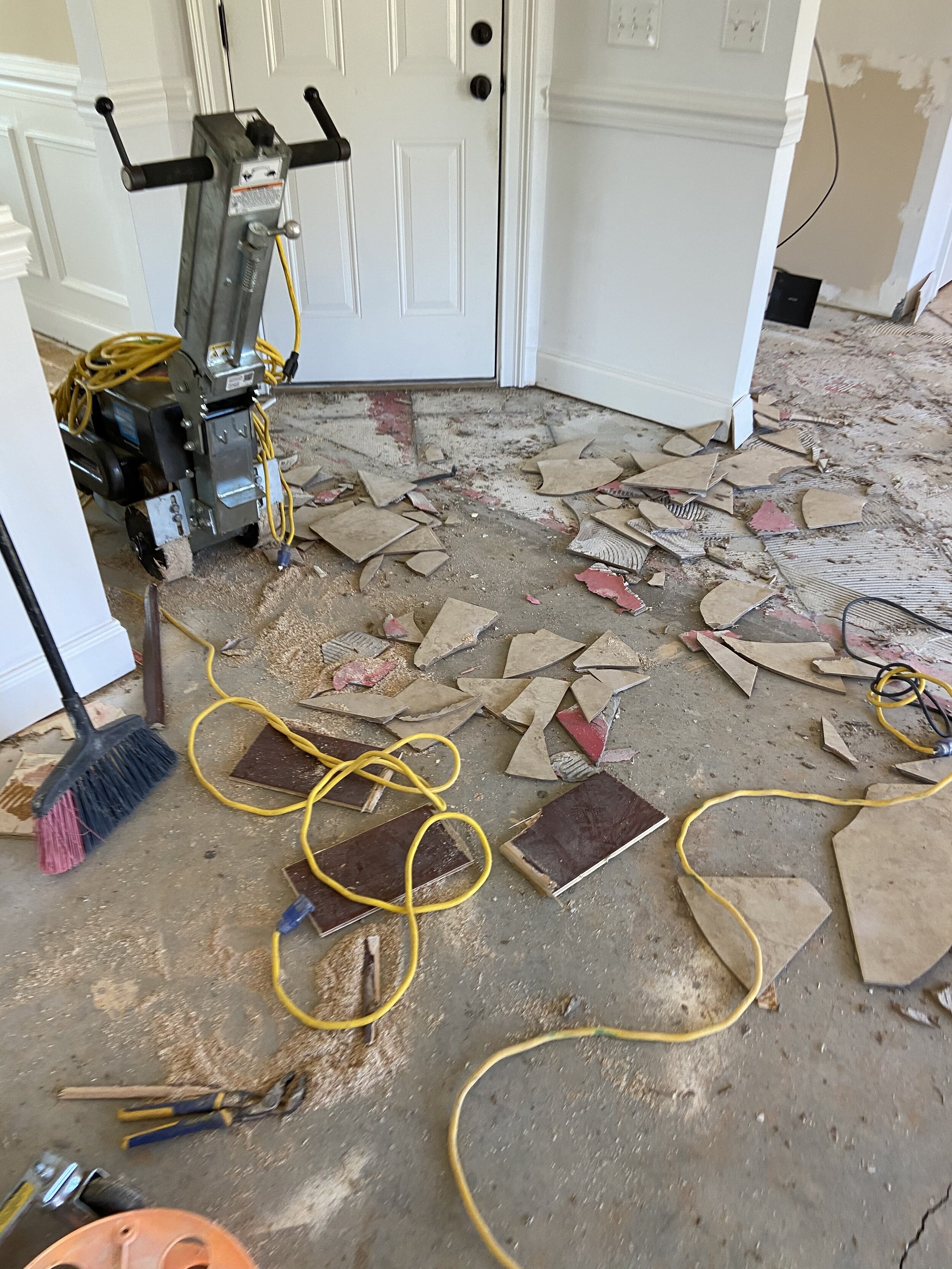
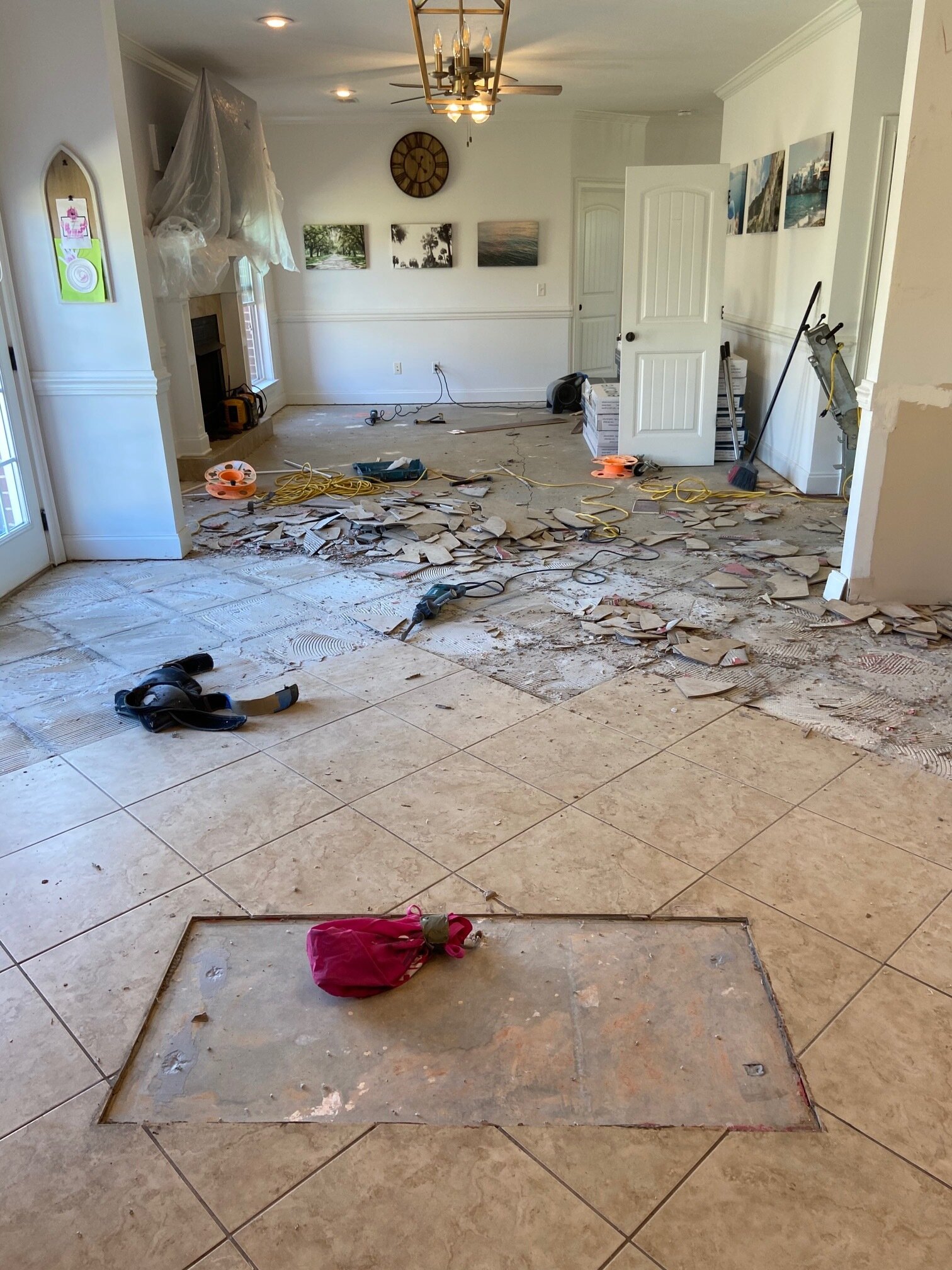
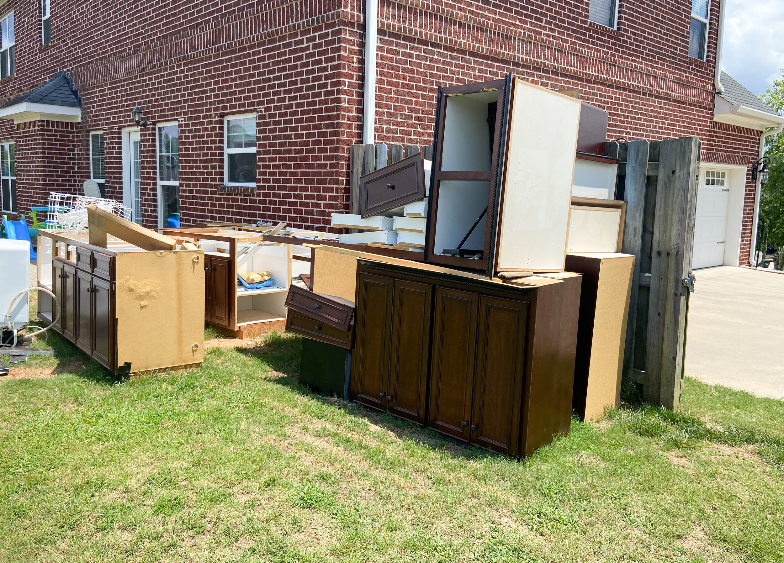
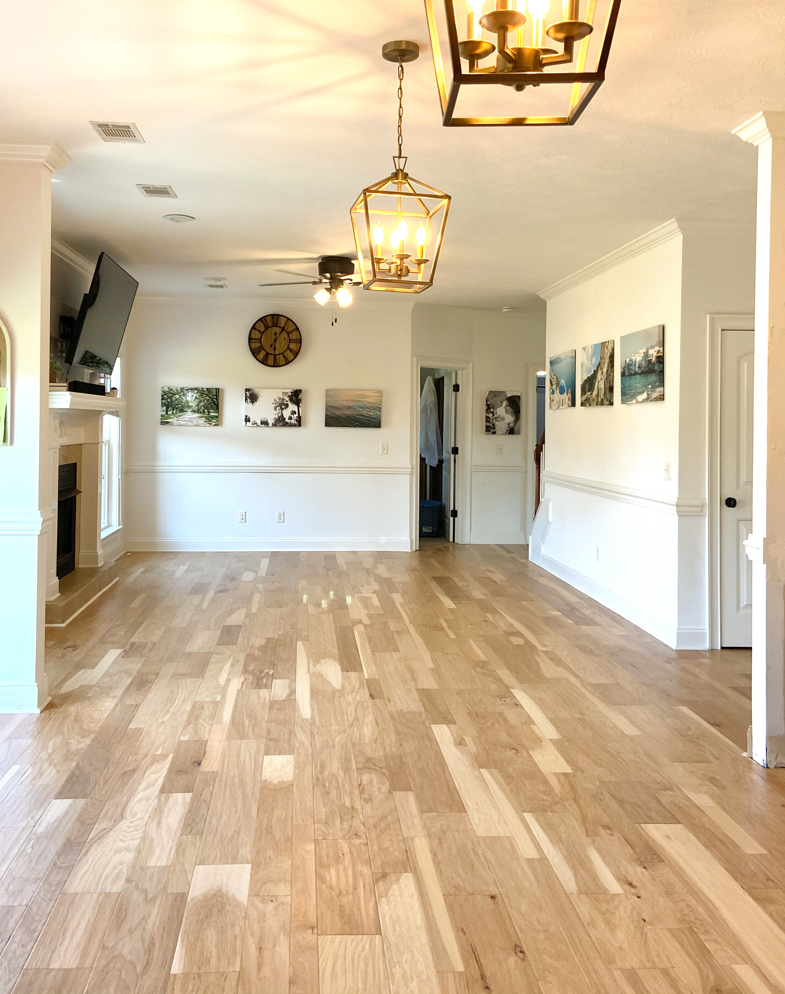
I don’t know how to categorize our style, it’s us for sure, a bit of traditional/modern/farmhouse all rolled into one! The first part of this renovation was the floor, Kirklands did an amazing job and we lived upstairs for two days lol. The floors are so much brighter and lighten it up! Nathaniel also had the brilliant idea to run the floors in the opposite direction of the old ones, which makes the space feel bigger. I included “before” photos of the house exactly how it looked when we bought it, the real life demo photos along the way, and finally the finished look all cleaned up! It was as messy as it looks, but not as stressful as I anticipated. We did a lot of cleaning in between each phase, and the kids and us had fun with it! (Don’t miss Woody and Buzz as you are scrolling!)
I hope y’all enjoy, and let me know if you have any questions and I’ll do my best to answer! And up next for the blog is our fireplace renovation, currently happening this coming Monday!
Cabinets & Hardware: Remodeler’s Warehouse
Quartz countertops: D & A Granite Countertops
Backsplash Install: Hall’s Flooring
Flooring: Kirkland’s Flooring
Plumber: Caputo Plumbing
Realtor: Nichole Cooper
Tile: Home Depot
Lights, Faucet, Rugs, & Mats: Amazon
Moved in the last day of February, leap day!
Lights: installed in March | Floors: installed in April | Cabinets: ordered in March, arrived in June | Countertops: June | Tile: June
photo above from realtor.com
photo above from realtor.com
photo above from realtor.com
photo above from realtor.com
photo above from realtor.com
